04 —Chapa

Reverse-engineering Ethiopia's most recognized fintech product.
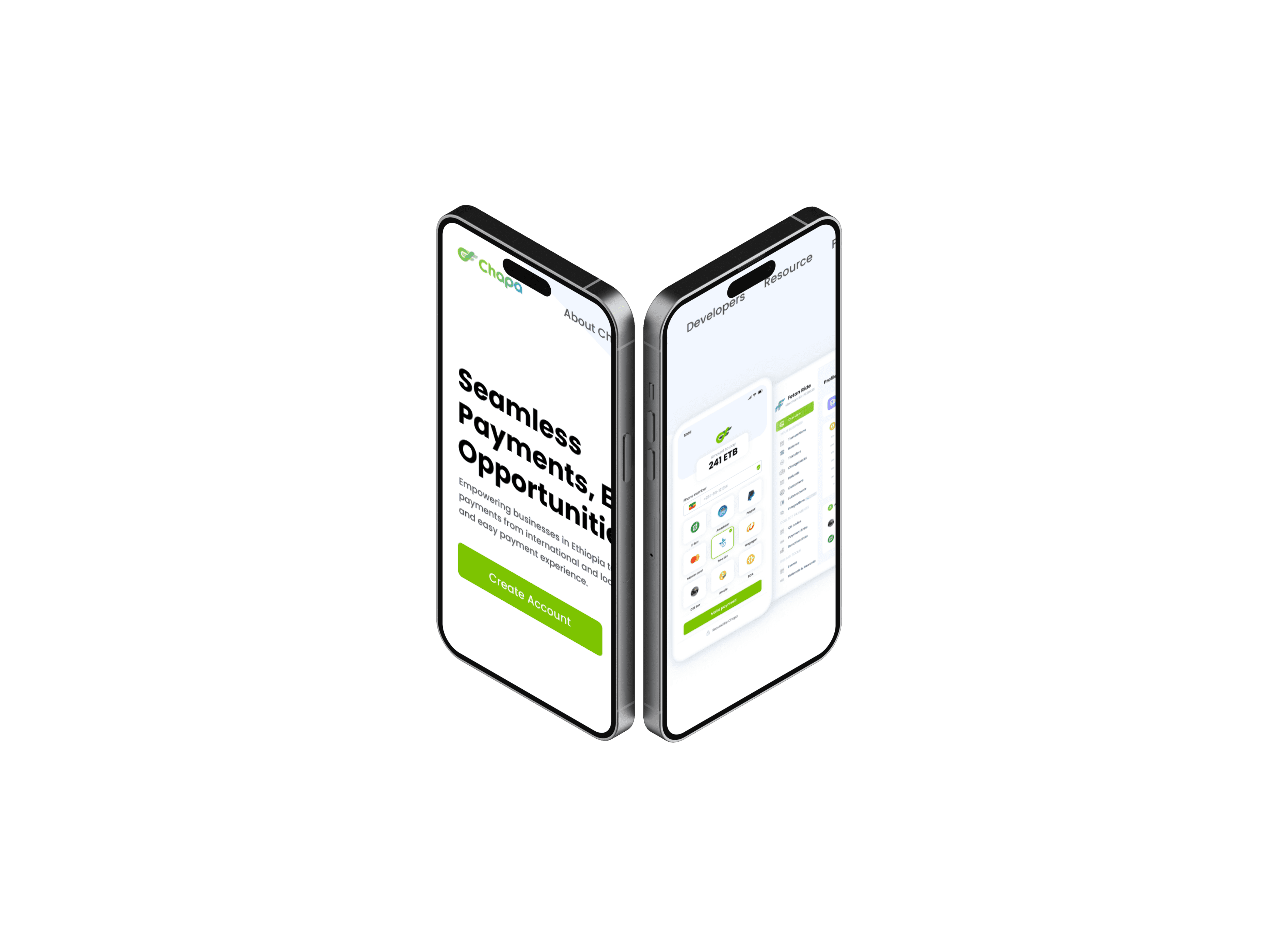
A pixel-accurate Figma recreation of Chapa's landing page — built to understand how great fintech design actually works.

Why This Project
Motivation
Chapa isn't just a product — it's the benchmark for digital finance in Ethiopia. Recreating their landing page meant studying every spacing decision, every component, every conversion choice they made and figuring out the logic behind it.

Approach
No shortcuts. No guessing.
Every section was rebuilt from scratch using only what's visible on screen — no source files, no dev tools for measurements. Auto layout, component architecture, and spacing systems were worked out entirely by eye and iteration.

What I Studied
Hierarchy, components, and the art of the CTA.
The clone revealed how Chapa uses visual hierarchy to guide without forcing — social proof lands exactly where doubt creeps in, and every CTA feels like a logical next step rather than a push. These are patterns worth knowing by memory.

Component Architecture
Building systems, not just screens.
Recreating the page exposed how much of Chapa's consistency comes from invisible systems — reusable components, shared text styles, and a grid that holds everything together quietly. Auto layout mastery came from getting this right repeatedly.
Outcome
A study that became a standard.
The final file is pixel-accurate and fully componentized. More than a portfolio piece, it's a reference I return to — a documented understanding of how a real product at scale is designed and structured.